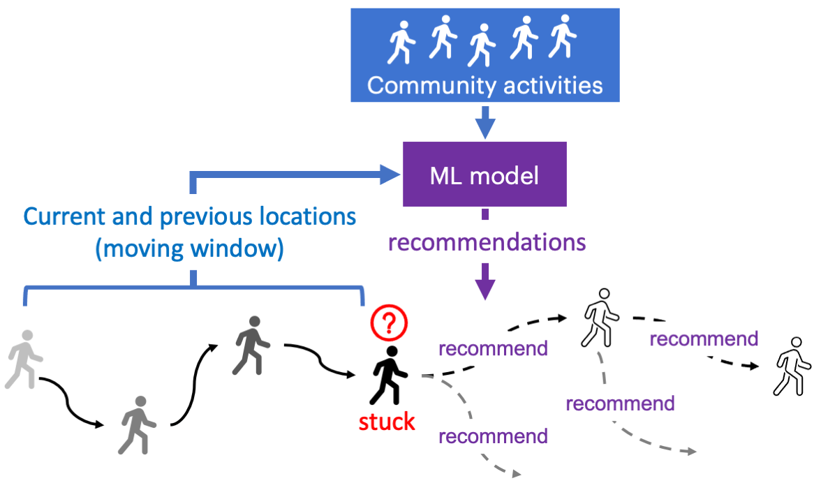
One of the main use cases of our metaverse lab is 3d body tracking. With Kinect DK’s SDK, 32 body joints can be detected or estimated from a single camera feed. The data for each joint include 3d coordinates (x, y, z) in the depth camera’s coordinate system, rotation matrix in quaternion (qw, qx, qy, qz), and a confidence metric. More details can be found in the SDK.
The results are already pretty good for application scenarios where there is a single subject and the person is facing the camera. Once there are multiple subjects in the scene or when the subject makes significant body movements, parts of the bodies are likely to be obstructed in the camera’s view. Although the SDK will still return data for all 32 joints, the estimated joint positions are often quite bad and should not be used for research. Another problem of the single camera tracking is the limited area coverage. Tracking performance art or sports activities would be difficult.

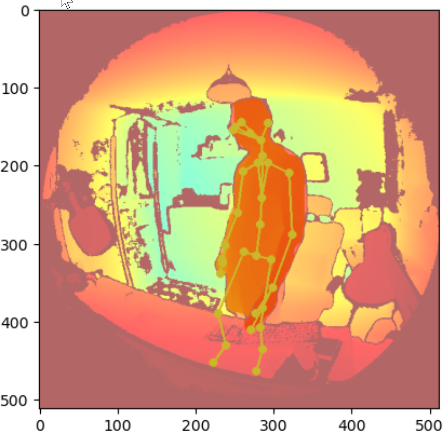
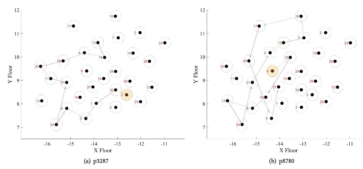
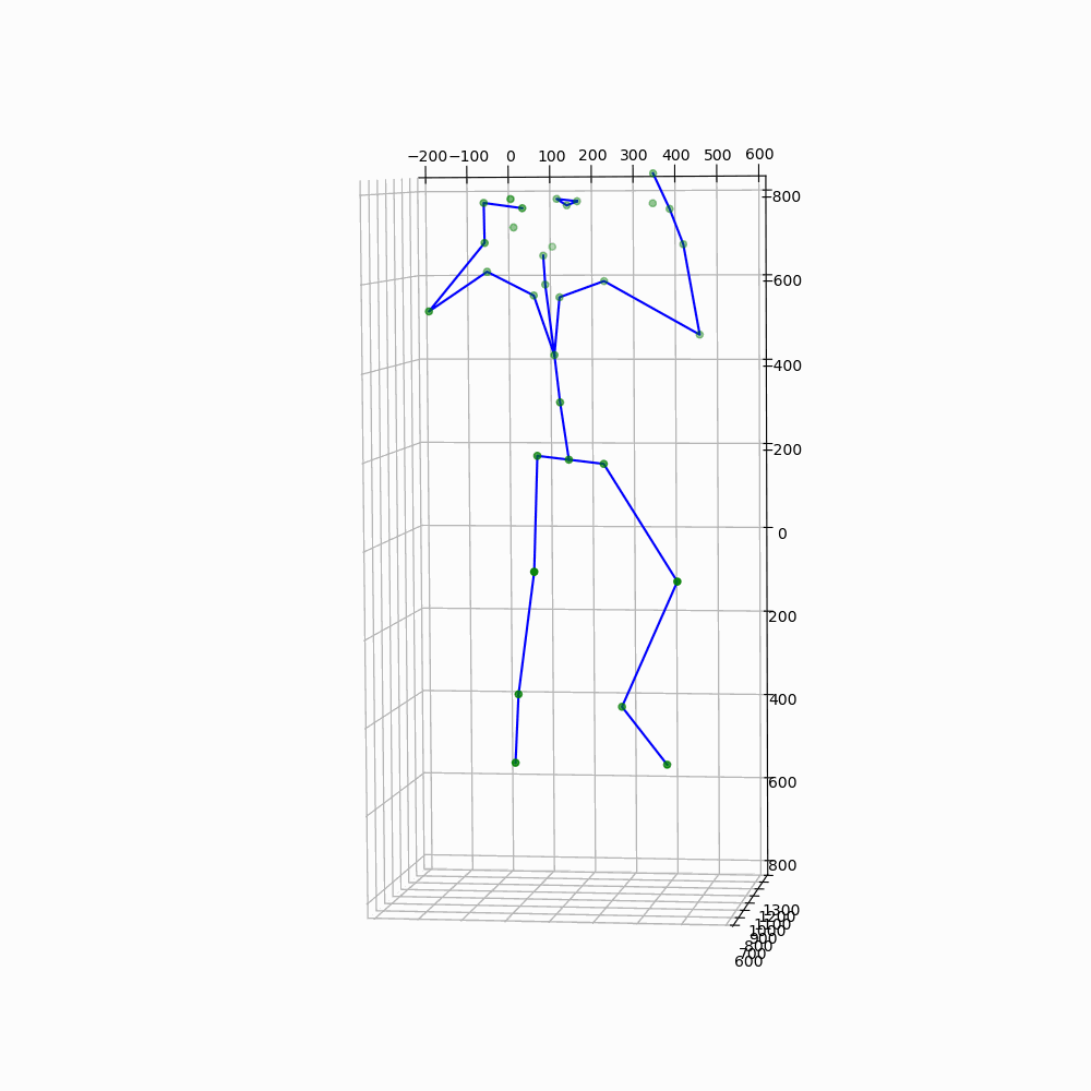
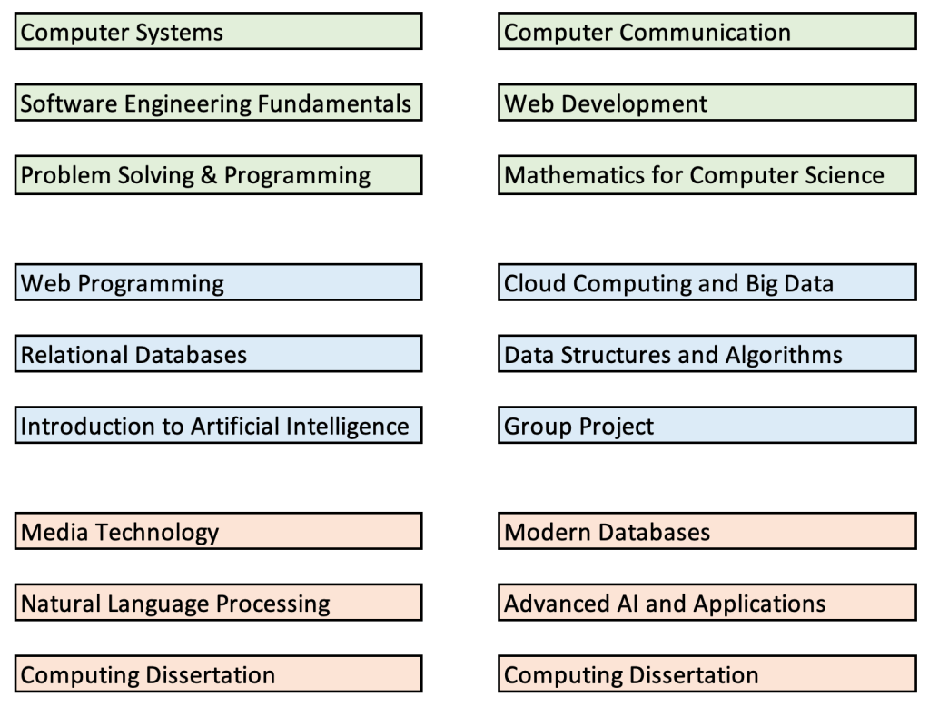
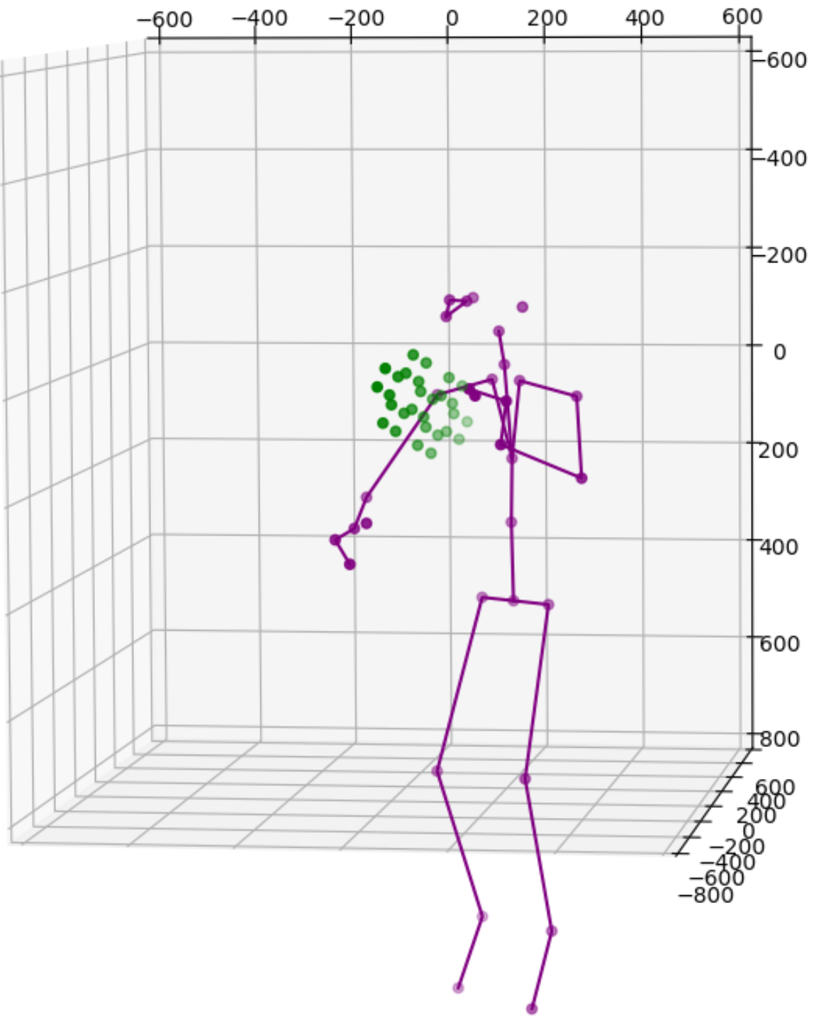
One solution is to simply add more cameras. Because each camera uses itself as the reference point to express the location of any object it sees, the same object will get different location readings from all cameras. For instance, the images above show data from 2 cameras of a single subject. Therefore we need to calibrate the data feeds from all cameras. This is normally done by transforming data from one coordinate system e.g., a secondary camera to a reference coordinate system e.g., the master camera. Ideally, the process will reshape the blue figure in the image above to match the shape of the purple figure exactly or vice versa. The transformation itself is straightforward using matrix multiplication but some work is needed to derive the transformation matrix between each camera pair. Luckily, OpenCV already includes a function estimateAffine3D() which computes an optimal affine transformation between two 3D point sets. So our main task is to get the associated 3D point sets from the 2 cameras. The easiest option to get the point sets is to reuse the 32 joint coordinates from cameras since they are tracking the same subject.

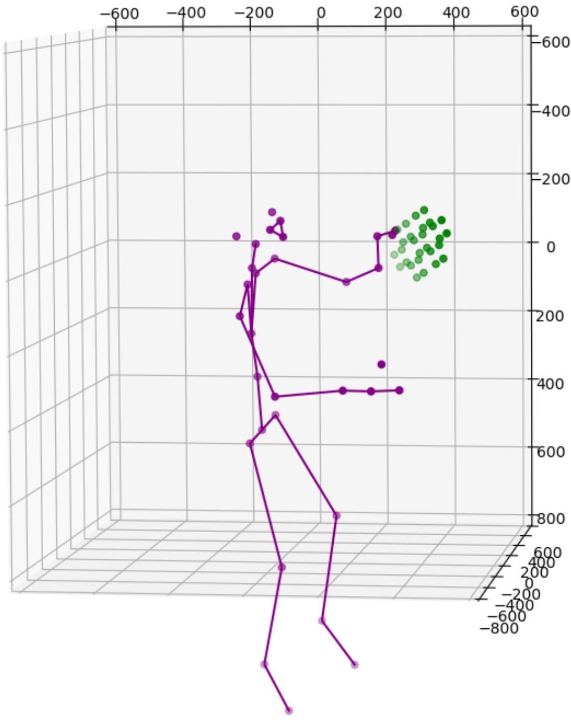
Feeding the joint coordinates to estimateAffine3D() will result in the above transformation matrix in homogeneous coordinates. I eliminated all low confidence joints to reduce the noise. In this case, the matrix is designed to transform readings from device 1 to device 2. The image below shows how the blue figure is mapped to the coordinate system of the purple figure. The result is nearly perfect from the chest above. The lower body is not great because they are not captured directly by our cameras.

Using body joints as markers for camera calibrations is promising but our results also clearly show some major issues: we can’t really trust the joint readings for accurate calibration. At the end of the day, the initial argument of the project was that each camera may have an obstructed view of the body joints. To find more reliable markers, I am again borrowing ideas from computer vision field: ChArUco.

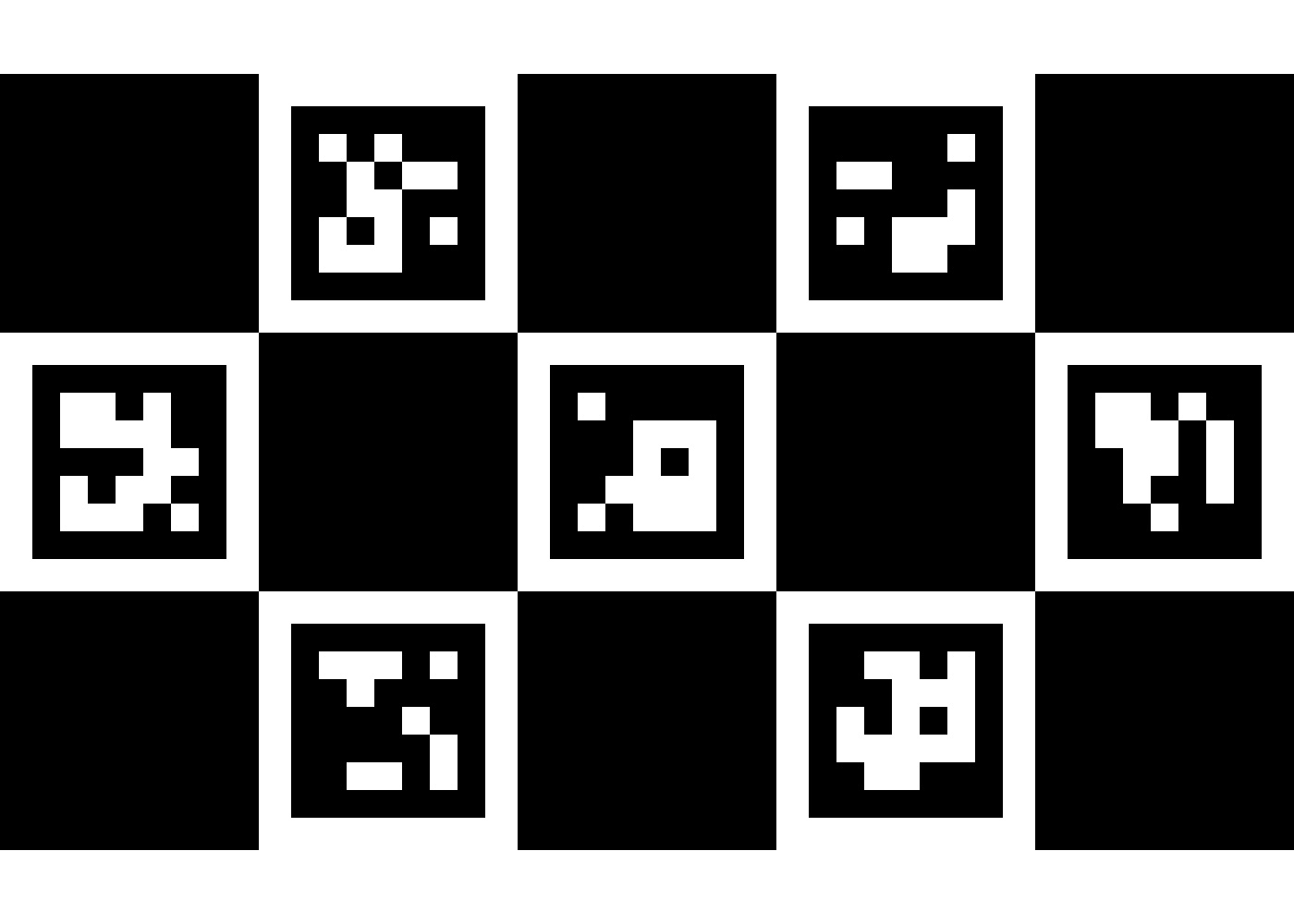
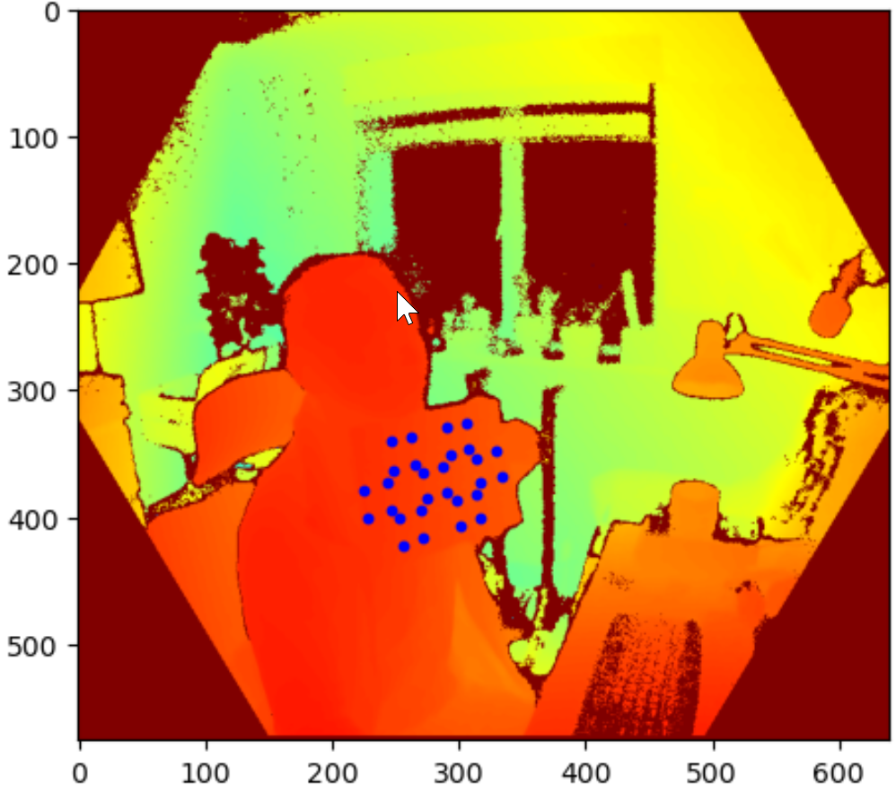
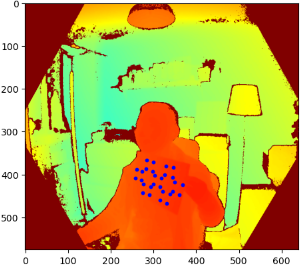
ArUco are binary square fiducial markers commonly used for camera pose estimation in computer vision and robotics. Using OpenCV’s aruco library, once can create a set of markers by defining marker size and dictionary size. the same library can be use to detect markers and their corners (x, y coordinates in a 2D image). The marker size determines the information fidelity, i.e., how many different markers is allowed. Each marker has its own ID for identification when multiple markers are present. The maximum dictionary size is therefore determined by the marker size but normally a much smaller dictionary size is chosen to increase the inter-marker differences. ChArUco is a combination of ArUco and chessboard to take advantage of ArUco’s fast detection and the more accurate corner detection permitted by the high contrast chessboard pattern. For my application scenario, ArUco’s corner detection seems accurate enough so ChArUco is only used to better match ChArUco boards on the front and back of a paper (more explanations below). The image below is a 3 by 5 ChArUco board with 7 ArUco makers (marker size 5 by 5 and dictionary size 250). This particular board has markers with the ID from 0 to 6.
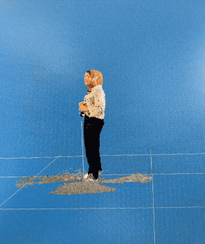
The idea is now to print out this ChArUco board on a piece of paper and let both cameras detect all marker corners for calibration. So I fire up the colour camera of Kinect DK and get the following result. Yes, I am holding the paper upside down but that’s ok.

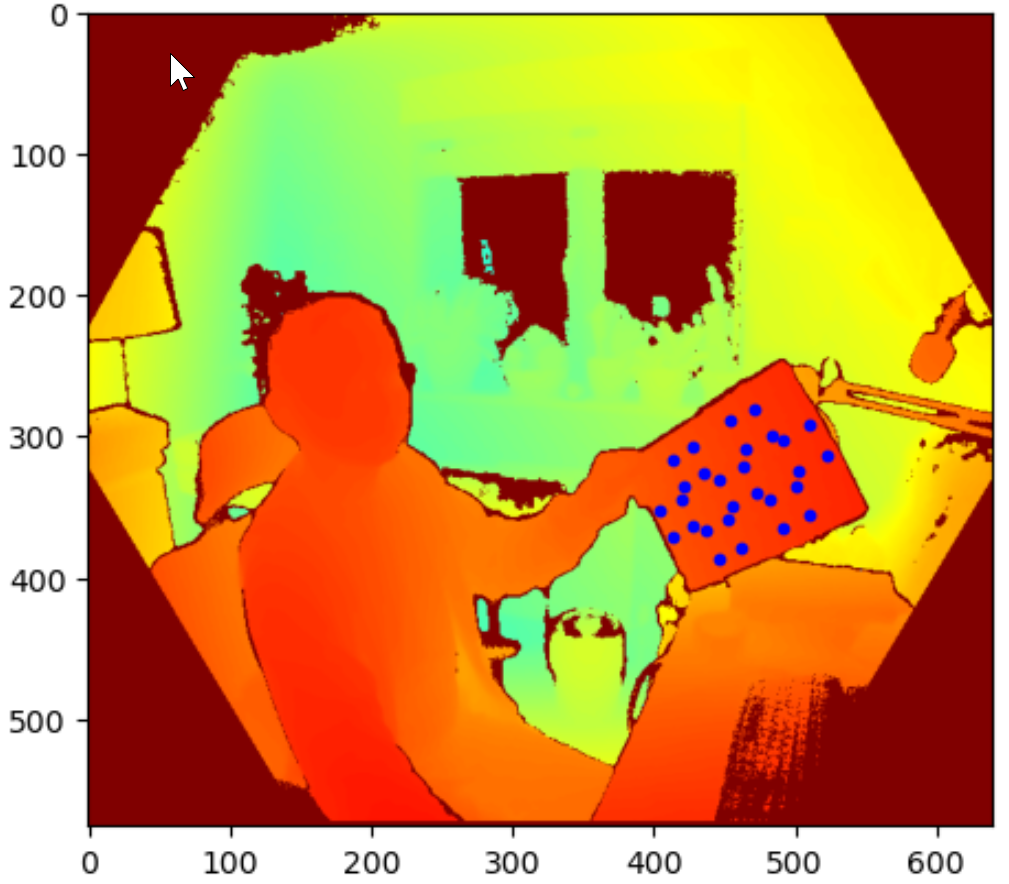
With 28 reference points from each camera, the next step is to repeat what was done on the 32 body joints and generate a new transformation matrix. However, additional step is needed. The marker detection was done using the colour camera because the depth camera could only see a flat surface and no markers. So all the marker coordinates are in the colour camera’s 2D coordinate system, i.e., all the red markers points in above image are flat with no depth. These points are then mapped to the depth camera’s 3D coordinate system using Kinect DK SDK’s transformation and calibration functions.

I am still looking for a better option but here are the 2-step approach:
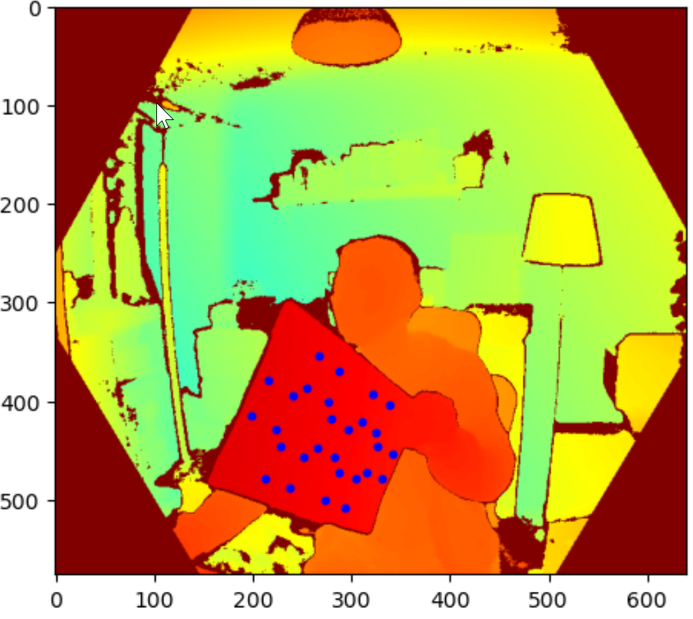
Firstly, all marker points are transformed from 2D colour space to 2D depth space as seem above (marker super-imposed on depth image). Knowing the locations of the markers on the depth image allowed me to find the depth information for all markers.

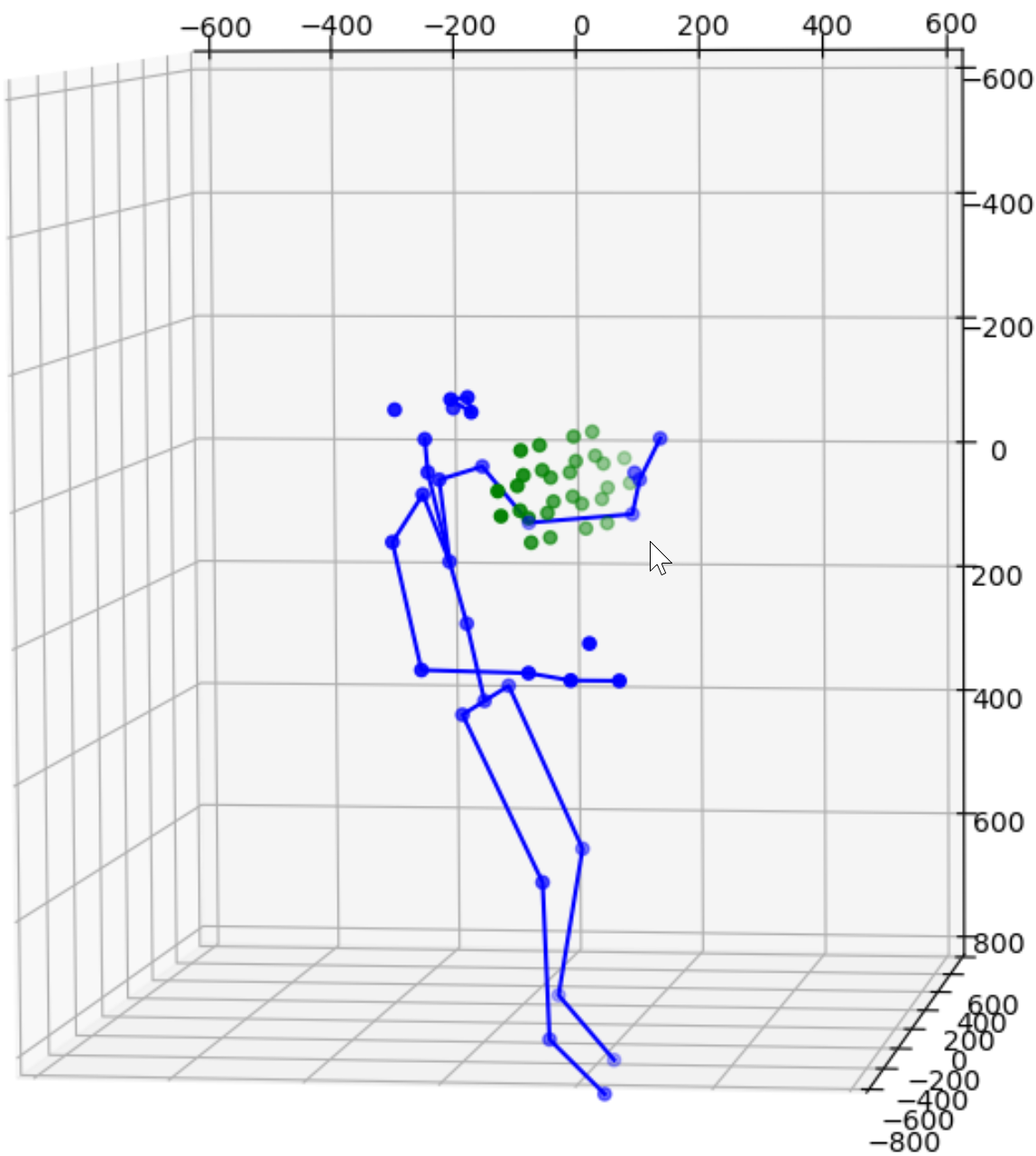
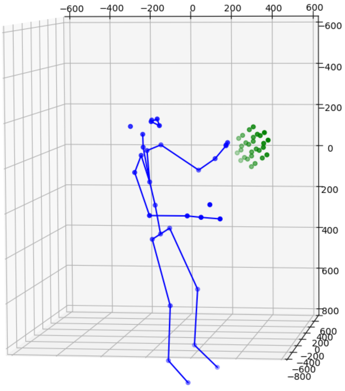
Next, markers are transformed from 2d depth space to 3d depth space to match the coordinate system for the body joints data. The images above show both makers and joints.
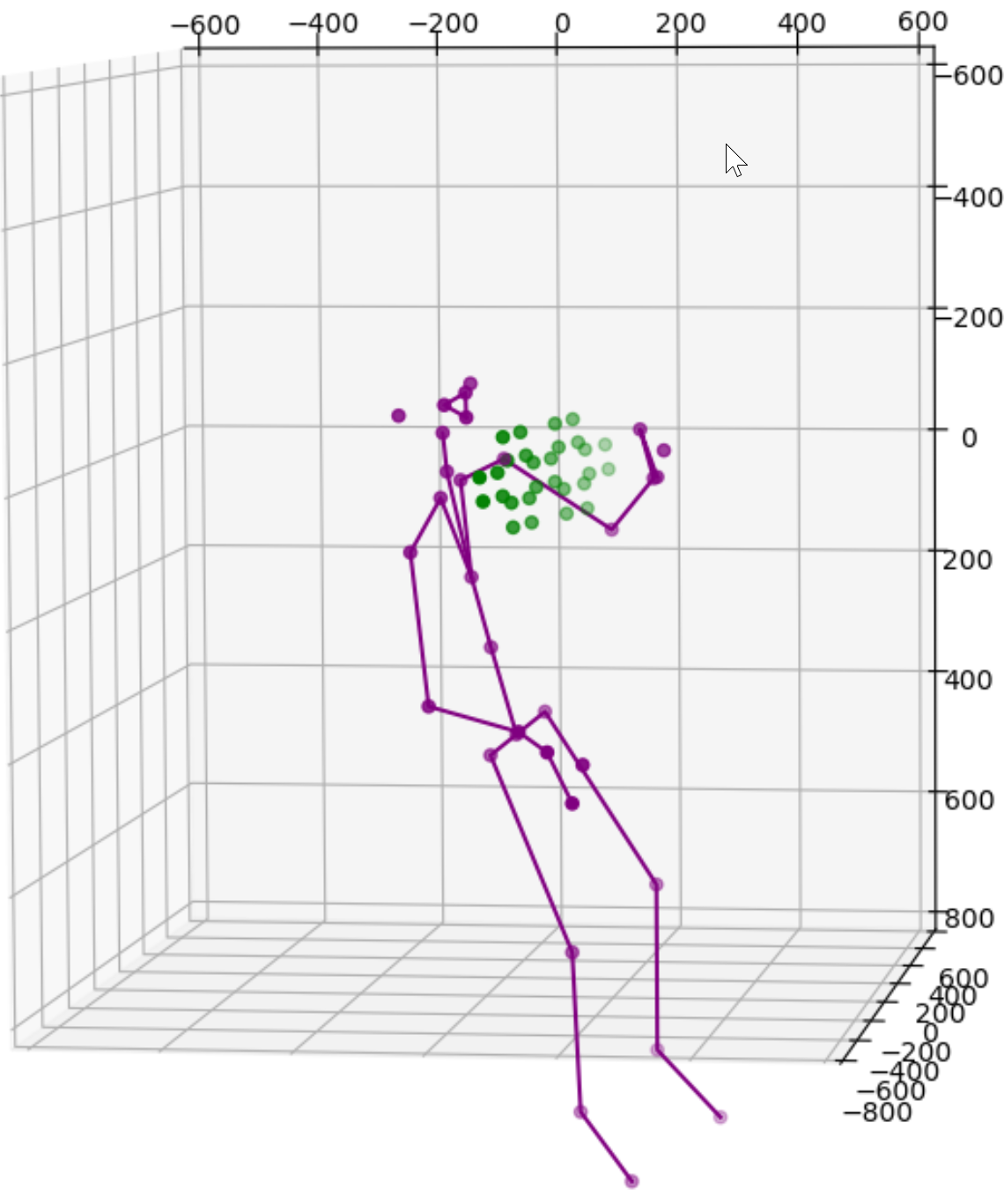
With the new sets of marker points a new transformation can be made from one camera to the other. All marker points are correctly mapped compared with data from the other camera. The joints are for reference only. I do not expect the joints to be mapped perfectly because they are mostly obstructed by the desk or the ChArUco board. I also eliminated a lot of small details here such many functions to keep the solution robust when some markers are blocked or failed to be recognised for any reason. Needless to say, this is only an early evaluation using a single ChArUco board on an A4 paper. I will certainly experiment with multiple boards while they are strategically positioned and board of different configurations.
Before I take this prototype out of the lab for a more extensive evaluation, there is another problem to solve. The current solution relies on both cameras having a good view of the same markers. This is fine only when the two cameras are not far apart. If we were to have 2 cameras diametrically opposed to each other to capture a subject from front and back, then it is very hard to place a ChArUco card viewable by both cameras. It would probably have to be on the floor while both cameras are tilted downwards. To solve this issue, I borrowed the idea from CWIPC‘s 2-sided calibration card.
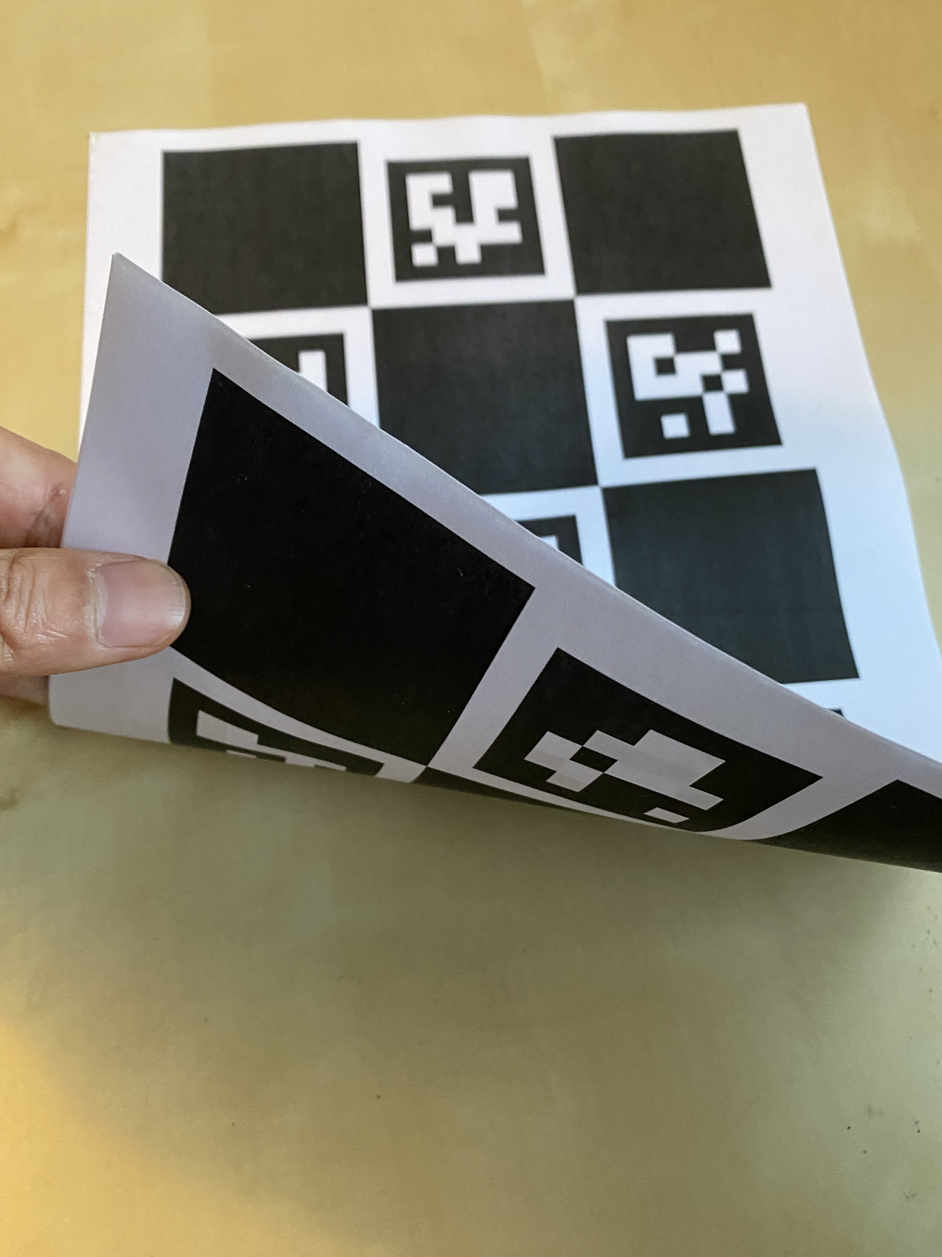
This 2-sided card has a standard ChArUco board on each side. The image above shows one side with marker ID 0 to 6 and the other side with marker ID 10 to 16. The corners of each marker on one side are aligned with a corresponding marker on the other side. So marker corners on one side are practically identical to marker corners detected by an different camera on the other side (with the error of the paper thickness that can be offset if necessary). A custom mapping function is developed to synchronise markers reported by cameras on each side of the paper. For instance, marker ID 0, 1, 2 are mapped to marker ID 12, 11, 15. The corner point order should also be changed so that all 28 points will be in the correct order on both sides. This approach requires some hard coding for each 2-sided card so I am hoping to automate this process in the future.
The following images show a test where I place this card between 2 cameras.
The transformation result is shown below. The solution is now also adaptive to detect whether multiple cameras are viewing the same side of the card or different sides of the card, and active different transformation options accordingly.
Overall, this is a simple and light-weight solution for multi-camera body tracking when the requirements for extrinsic calibration are not as significant as those of volumetric capturing. The next step for this project is real-world evaluation with selected use cases. There are still a lot of improvements to be made especially the automation and robustness of the detection and calibration.