Most research in communication networks are quite fundamental such as sending data frame from point A to point B as quickly as possible with little loss on the way. Some networking research can also benefit communities indirectly. I recently started a new collaboration with our University IT department on a smart campus project where we use anonymised data sampled from a range of on-campus services for service improvement and automation with the help of information visualisation and data analytics. The first stage of the project is very much focused on the “intent-based” networking infrastructure by Cisco on Waterside campus. The SoTA system provides us with a central console and APIs to manage all network switches and 1000+ wireless APs. Systematically studying how user devices are connected to our APs can help us, in a non-intrusive fashion, better understand the way(s) our campus are used, and use that intelligence to improve our campus services. Although it’s possible to correlate data from various university information systems to infer ownership of devices connected to our wireless networks, my research does not make use of any data related user identity at this stage. Not only because it is unnecessary (we are only interested in how people use the campus as a whole), but also because how privacy and data protection rules are implemented. This is not to say that we’ll avoid any research on individual user behaviours. There are many use cases around timetabling, bus services, personal wellbeing and safety that will require volunteers to sign up to participate.
This part 1 blog shares the R&D architecture and some early prototypes of data visualisation before they evolve into something humongous.
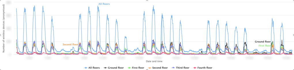
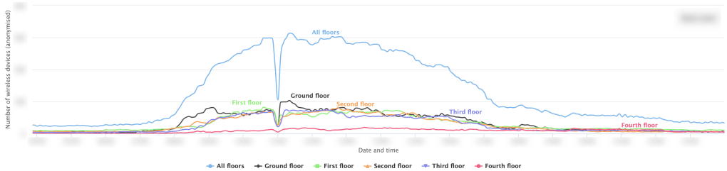
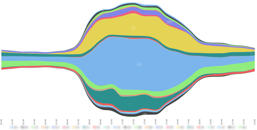
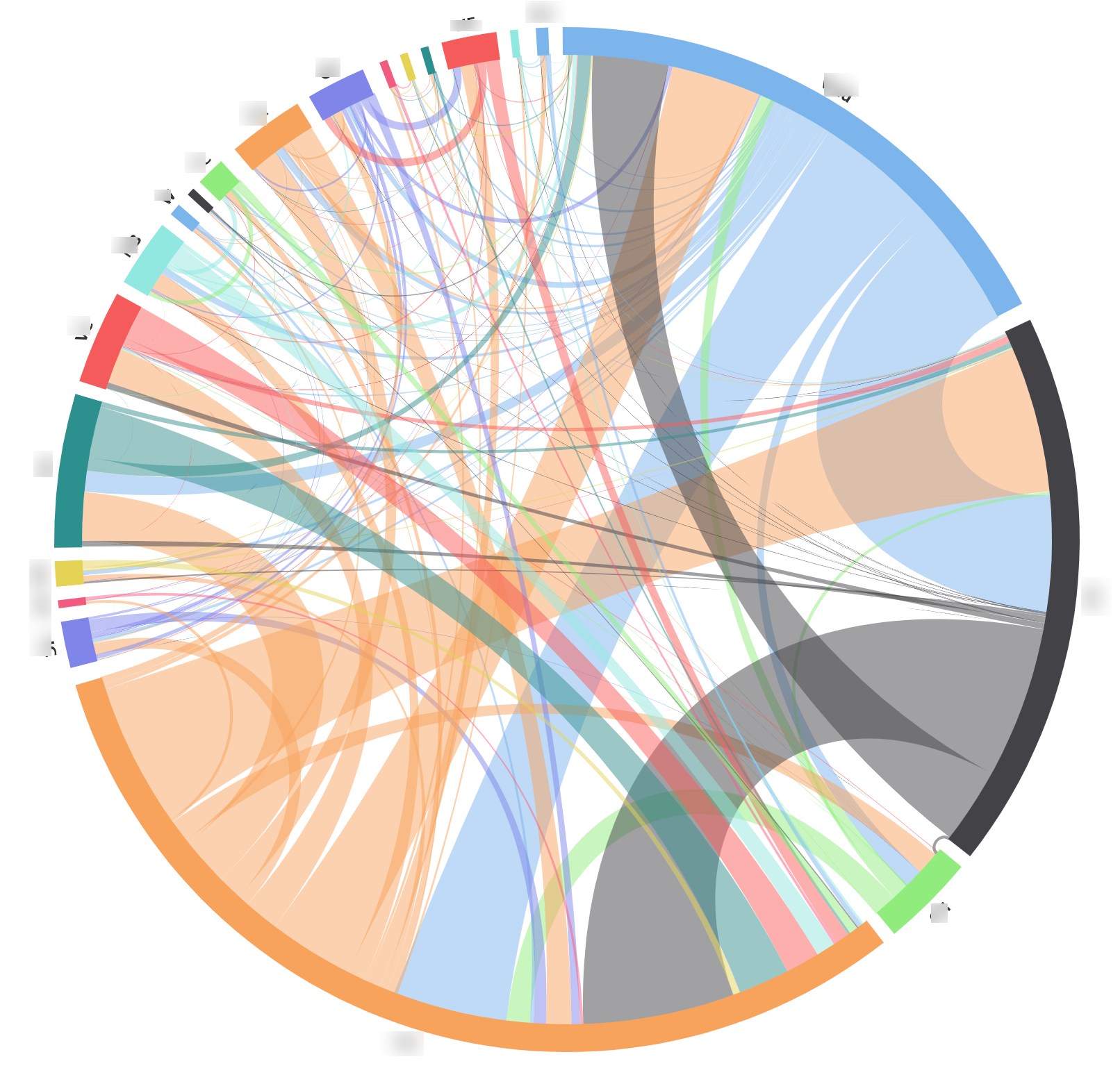
A few samples of the charts we have:


So how were the charts made:
The source of our networking data is the Cisco controllers. The DNA centre offers secure APIs while the WLC has a well structured interface for data scraping. Either option worked for us so we have Python-based data sampling functions programmed for both interfaces. What we collect is a “snapshot” of all devices in our wireless networks and the details of the APs they are connected to. All device information such as MAC addresses can be hashed as long as we can differentiate one device from another (count unique devices) and associate a device across different samples. We think devices’ movements on campus as a continuous signal. The sampling process is essentially an ADC (analog to digital conversion) exercise similar to audio sampling. The Nyquist Theorem instructs us to take a minimum sampling frequency as least twice the highest frequency of the analog signal to faithfully capture the characteristics of the input. In practice, the signal frequency is determined by the density of wireless APs in an area and how fast people travel. In a seating area on our Learning Hub ground floor, I could easily pass a handful of APs during a minute long walk. Following the math and sampling from control centre every few seconds risks killing the data source (and unlikely but possibly entire campus network). As the first prototype, I compromised on a 1/min sampling rate. This may not affect our understanding of the movement between buildings that much (unless you run really fast between buildings) but we might need some sensible data interpolation for indoor movements (e.g., a device didn’t teleport from the third floor library to a fourth floor class room, it traveled via stairwell/lift).
The sampling outcome are stored as data snippets in the format of Python Pickle files (one file per sample). The files are then picked up asynchronously by a Python-based data filtering and DB insertion process to insert the data in a database for data analysis. Processed Pickle files are archived and hopefully never needed again. Separating the sampling and DB insertion makes things easier when you are prototyping (e.g., changing DB table structure or data type while sampling continues).

With the records in our DB growing at a rate of millions per day, some resource intensive pre-processing / aggregation (such as the number of unique devices per hour on each floor of a building) need to be done periodically to accelerate any following server-side functions for data visualisation, reducing the volume of data going to a web server by several orders of magnitude. This is at the cost of inserting additional entries in the database and risking creating “seams” between iterations of pre-processing but the benefit clearly outweighs the cost.
The visualisation process is split into two parts: the plot (chart) and the data feed. There are many choices for professional-looking static information plotting such as Matplotlib and ggplot2 (see how the BBC Visual and Data Journalism team works with graphics in R). Knowing that we’ll present the figures in interactive workshops, I made a start with web-based dynamic charts that “bring data to life” and allow us to illustrate layers of information while encouraging exploring. Frameworks that support such tasks include D3.js and Highcharts (a list of 14 can be found here). Between the two, D3 gives you more freedom to customise your chart but you’ll need to be a SVG guru (and a degree of artistic excellence) to master it. Meanwhile, Highcharts provides many sample charts for you to begin with and the data feed is easy to programme. It’s an ideal tool for prototyping and only some basic knowledge of Javascript is needed. To feed structured data to Highcharts, we pair each chart page with a PHP worker for data aggregation and formatting. The workflow is as follows:
1) The client-side webpage loads all elements including the Highcharts framework and the HTML elements that accommodates the chart.
2) A JQuery function waits for the page load to complete and initiates a Highcharts instance with the data feed left open (empty).
3) The same function then calls a separate Javascript function that performs an AJAX call to the corresponding PHP worker.
4) The PHP worker runs server-side code, fetches data from MySQL, and performs any data aggregation and formatting necessary before returning the JSON-encoded results back to the front-end Javascript function.
5) Upon receiving the results, the Javascript function conducts lightweight data demultiplexing for more complex chart types and set the data attribute of the Highcharts instance with the new data feed.
For certain charts, we also provided some extra user input fields to help dealing with user queries (e.g., plot data from a particular day).

Reblogged this on SDCN: Software Defined Cognitive Networking.