The provision of education for children with Special Educational Needs and Disabilities (SEND) is currently facing systemic challenges. In some local areas, the gap between strategic ambition and lived reality is stark, evidenced by nearly 7,000 school suspensions in one academic year. This crisis is not merely administrative; it represents a profound loss of potential for young people and creates a staggering financial burden, where just 50 permanent exclusions can generate a future liability to the state of nearly £10 million.

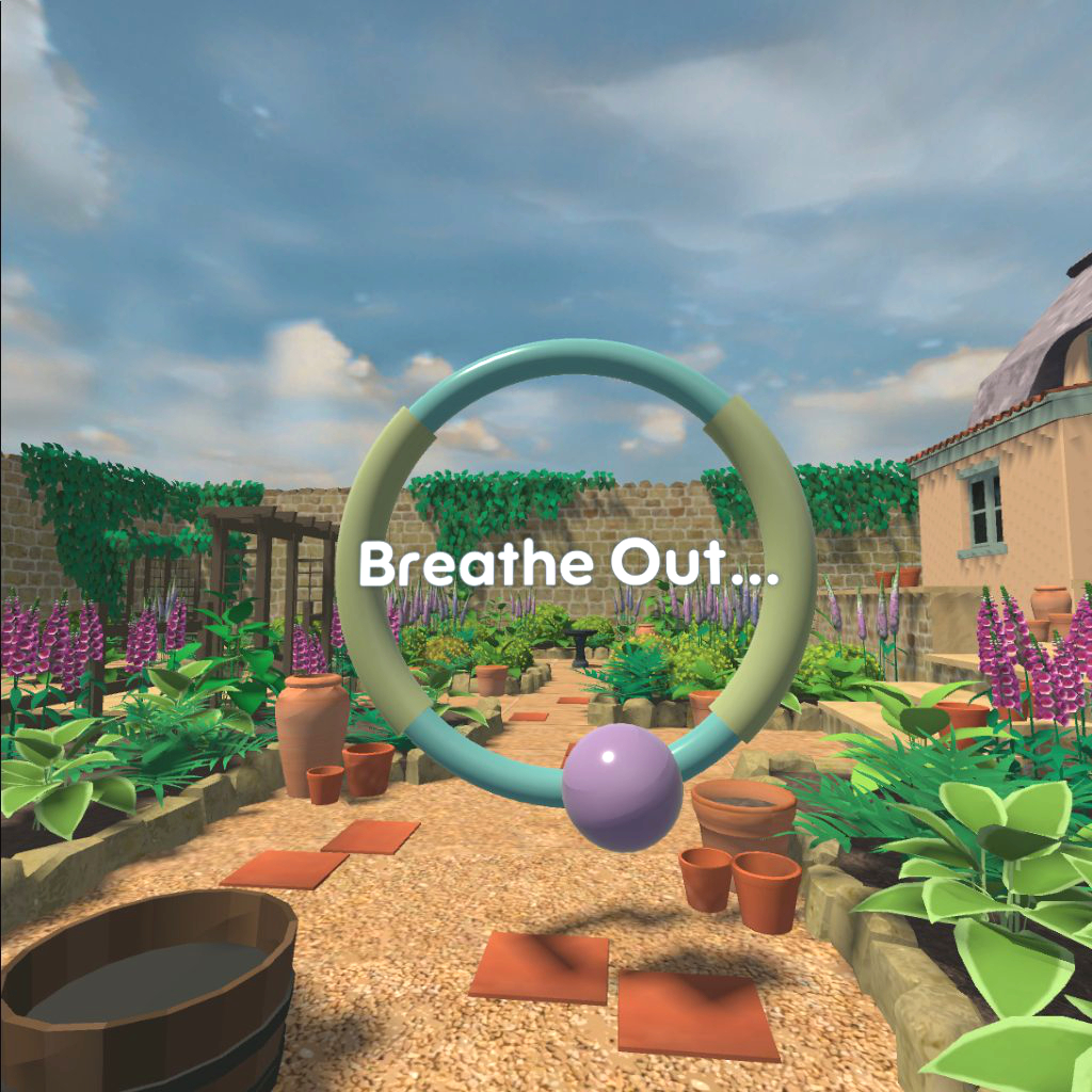
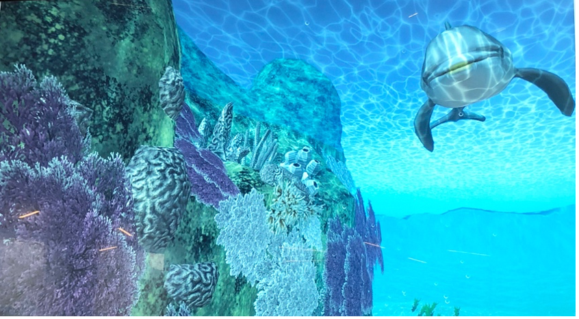
At the University of Northampton, we believe it is time for a paradigm shift from reactive crisis management to proactive, evidence-based prevention. In partnership with West Northamptonshire Council (WNC), Northamptonshire Healthcare NHS Foundation Trust (NHFT), and local schools, we are piloting Wave: a preventative Virtual Reality (VR) therapeutic intervention.
Wave is designed to support young people who may be resistant to conventional “talk therapy.” By integrating proven principles of evidence-based therapies into an immersive VR environment, we are creating a tool that feels less like a clinical appointment and more like a “training game.”
How Wave Works:
- Stigma Reduction: By gamifying the therapeutic process, we lower the barrier to entry for adolescents struggling with anxiety and disruptive behaviours.
- Skill Building: The intervention guides users to practise mindfulness, emotional regulation, and distress tolerance in a safe, controlled environment.
- Accessibility: It is designed for deployment in mainstream schools, SEND settings, and Family Hubs, reaching young people where they are.
Through mixed-method studies, we aim to demonstrate that digital innovation can deliver tangible returns. The human impact: helping children fulfil their potential and avoid the “shadow SEND system” is our primary driver.
This project supports the NHS “Fit for the Future” 10-Year Plan, moving the service toward greater responsiveness and technological advancement. We have successfully moved past the conceptual stage and are now refining the intervention based on real-world feedback from clinical psychologists and young people with learning disabilities.
We are currently piloting these solutions in Northamptonshire, but our vision is scalable. We welcome dialogue with educational trusts, healthcare providers, and potential funding partners who are interested in rigorous, technology-driven mental health solutions.
If you are interested in the intersection of digital innovation and youth mental health, or wish to support the expansion of this pilot, we invite you to connect with us.