I have been playing with the project data to study the impact of COVID-19 social distancing / lockdown to the university, especially the use of campus facilities. Meanwhile there are some time series analysis and behavioural modelling that I’d like to complete sooner than later. Everything has taken me so much longer than what I planned. Here are some previews followed by moaning, i.e., the painful processes to generate these.

The above shows some regular patterns of crowd density and how the numbers dropped due to COVID-19 lockdown. Students started to reduce their time on campus in the week prior to the official campus closure.
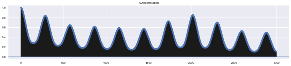
The autocorrelation grape shows a possible daily pattern (data resampled in 5 minute interval so 288 samples is a day, hence the location of the first peak).

Seasonal decomposition based on the hypothesis of a weekly pattern. There is also a strong hourly pattern, which I’ll explain in the paper (not written yet!).
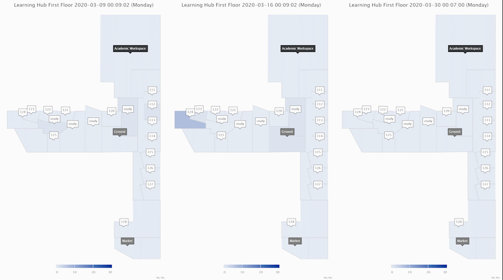
These ones above show the area crowd density dynamics of one floor of an academic building. The one on the left shows how an academic workspace, a few classrooms and study areas were used during a normal week when few people in the UK felt the COVID-19 is relevant to them. The middle one shows the week when there were increasing reports of COVID-19 cases in the UK and the government was changing its tones and advising social distancing. Staff and students reduced their hours on campus. The one on the right shows a week during university closure (building still accessible for exceptional purposes).
Using the system to monitor real-time crowd data provides a lot of insights but its somehow passive. It’s the modelling, simulation and predictions that make the system truly useful. I have done some work on this and I’ll gradually update this post with some analysis results:
The first thing I tried is standard time-series analysis. A lot of people don’t think it’s a bid deal but it’s tricky to get things right. There are many models to try and they are all based on the assumption that we can predict future data based on previous observations. ARIMA (Auto Regressive Integrated Moving Average) is a common time-series analysis method characterised by 3 terms: p, d, q. Tother they work on which part(s) of the observed data to use and how to adjusted the data (based on how thing change over time) to form a prediction. The seasonal variation of ARIMA (SARIMA) introduces additional seasonal terms to capture seasonal differences. Our campus WIFI data is not only non-stationary but also has multiple seasonality embedded: from a high level, the university has terms, each term has a start and end with special activities, each week of the term has weekdays and weekends, each weekday has lecturing hours and non-lecturing hours. The standard SARIMA can only capture one seasonality but it will be our starting point to experiment with crowd predictions.

Figure above shows the predictions of campus occupant level on Friday 6th March. The blue curve plots the observed data on that week (Monday to Friday). The green curve depicts the “intra-week” predictions based on data observed during the same week, i.e., using Monday-Thursday’s data to guess Friday’s data. This method can respond to extraordinary situations in a particular week. If we chain all weekday data then in theory it’s possible to make prediction for any weekday of the week, practically ignoring the differences across weekdays. However, we know that people’s activities across weekdays are not entirely identical. Students have special activities on Wednesdays and everyone tries to finish early on Fridays. This explains why the intra-week predictions overestimate occupancy level for Friday afternoon. The orange curve gives the “inter-week” prediction based on previous four Fridays. This method captures normal activities on Fridays but is agnostic to week-specific changes (e.g., the week prior to exams). Balancing intra- and inter-week predictions using a simple element-wise Mean, the red curve shows the “combined” prediction. For this particular prediction exercise, the combined method does not show better MSE measurement compared with the inter-week version, partially due to the overestimates.
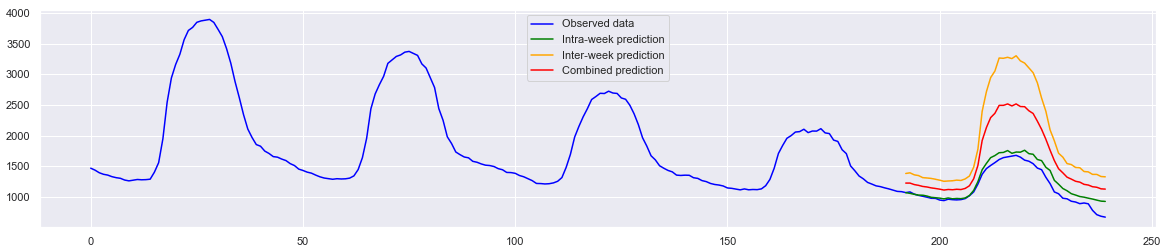
Figure above shows the week prior to the university’s closure in response to COVID-19. This week is considered an “abnormal” week as students and staff started to spend more time study or work from home. In this case, the intra-week model successfully captures the changes on that week. There must be a better way to balance the two model to take the best from both worlds but I will try other options first.
All modelling above were done using pmdarima, a Python implementation of the R’s auto.arima feature. To speed up the process, the data was subsampled to a 30-minute interval. The number of observations per seasonal cycle m was set as 48 (24 hours x 2 samples per hour) to define a daily cycle.
[more to come soon]
Some technical details…
- The main tables on the live DB have 500+ million records (which takes about 300 GB space). It took a week to replicate it on a second DB so I can decouple the messy analysis queries from the main.
- A few python scripts to correlate loose data in the DB which got me a 150+ GB CSV file for time series analysis. From there, the lovely Pandas happily chews the CSV like its bamboo shoots.
- The crowd density floor map was done for live data (10 minute coverage). To reprogramme it for historical data and generate the animation above, a few things have to be done:
- A python script ploughed through the main DB table (yes the one with 500 million records) and derive area density in a 10-minute interval. The script also did a few other things at the same time so the whole thing took a few hours.
- A new PHP page loaded the data in, then some Javascripts looped through the data and display the charts dynamically. It’s mainly setIntervals() to call Highcharts’ setData, removeAnnotation and addAnnotation.
- To save the results as videos / GIFs, I tested screen capturing, which turned out to be OK but recording the screen just didn’t feel right to me. So I went down the route of image exporting and merging. Highcharts’ offline exporting exportChartLocal() works pretty well within the setIntervals() loop until a memory issue appeared. Throwing in a few more lines of Javascript to stagger the exporting “fixed” the issue. FFMPEG was brought in to covert image sequence to video.
- Future work will get all these tidied up and automated.
[to be continued]
